Past Event: Nov 09, 2023
Retrouvez Boxfusion Consulting lors de l’événement Oracle Applications Unlimited Days, en France
1 min read

Author: Jake Patterson
4 min read
Welcome to part one of this four part series on the user experience (UX) benefits of Siebel Open UI. In this post I will explore some of the possibilities that Open UI provides for visualising our Siebel data in new and interesting ways. With Siebel Open UI, we’re not confined to using lists and forms as we are in current Siebel applications – instead, we can display our data in almost any way imaginable!
Of course some data lends itself well to being displayed in a list or on a form, as is common in Siebel, but there is no doubt that certain data sets would benefit from being displayed in a more visual way. The Siebel Open UI framework allows us to supplement or even replace Siebel’s traditional list and form applets with any of the thousands of compatible ‘plug-ins’ which are readily-available on the Web and which can dramatically change how our Siebel data is displayed.
Take a look at the screenshot below – here I’ve created an interactive pie chart which is displayed next to the familiar Siebel list applet on the Account Opportunities view. Thanks to the chart, users can instantly see their most valuable opportunity with no effort at all. To drill down on that record, they simply click on the slice of the pie!
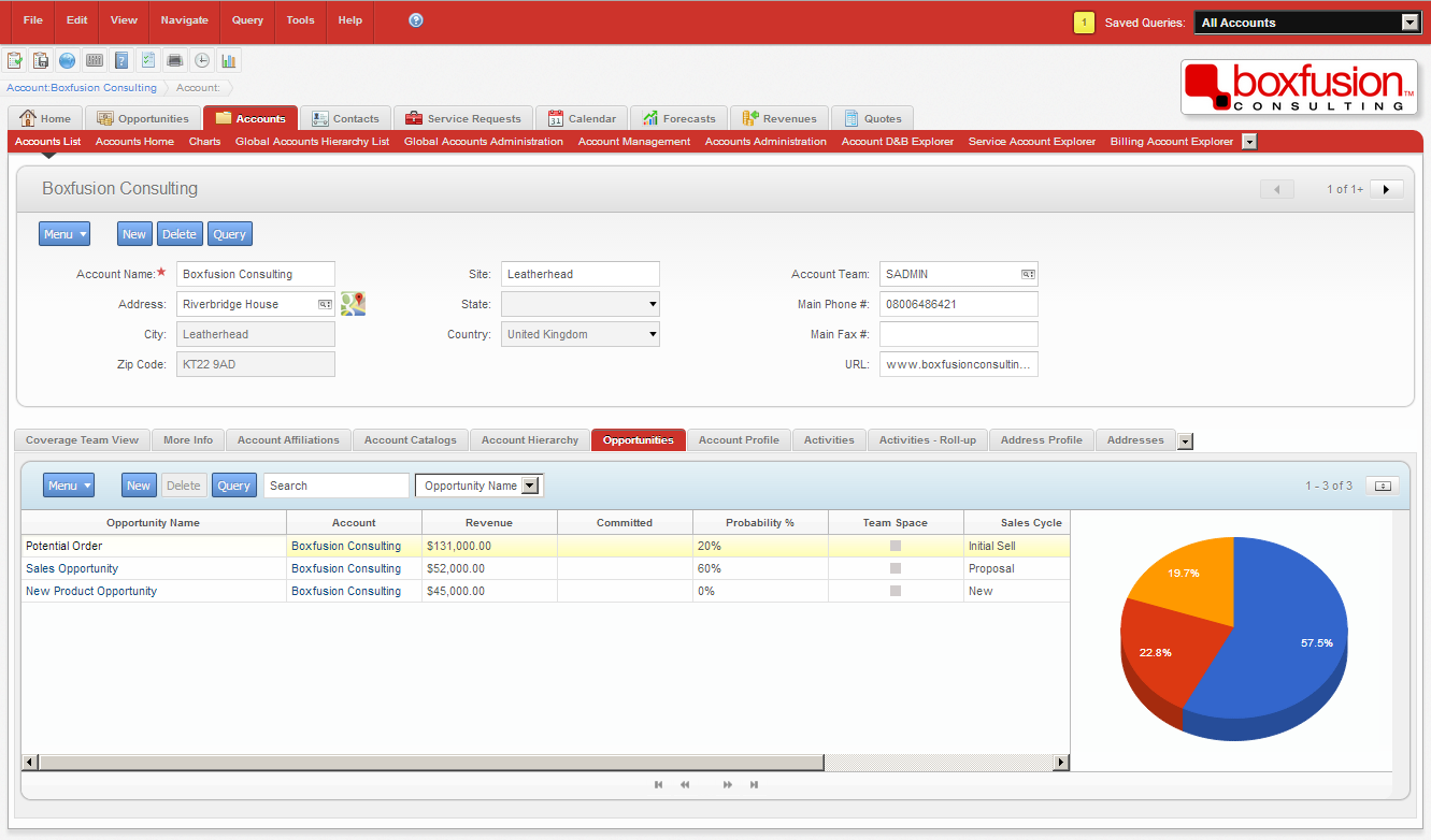 A simple embedded chart (built using the Google Charts API) to provide users with a quick and effective overview of the data contained in the adjacent list applet.
You’ll notice in the next screenshot that when the user hovers their mouse over the pie slices they’re given more information about the record in question. Here it’s just the name but there’s no reason why we couldn’t include more data such as the revenue amount or even the sales team. The pie chart also responds instantly to queries and changing field values. Visualising the data in this way can help users to quickly identify their most important records; instantly this screen is much more intuitive.
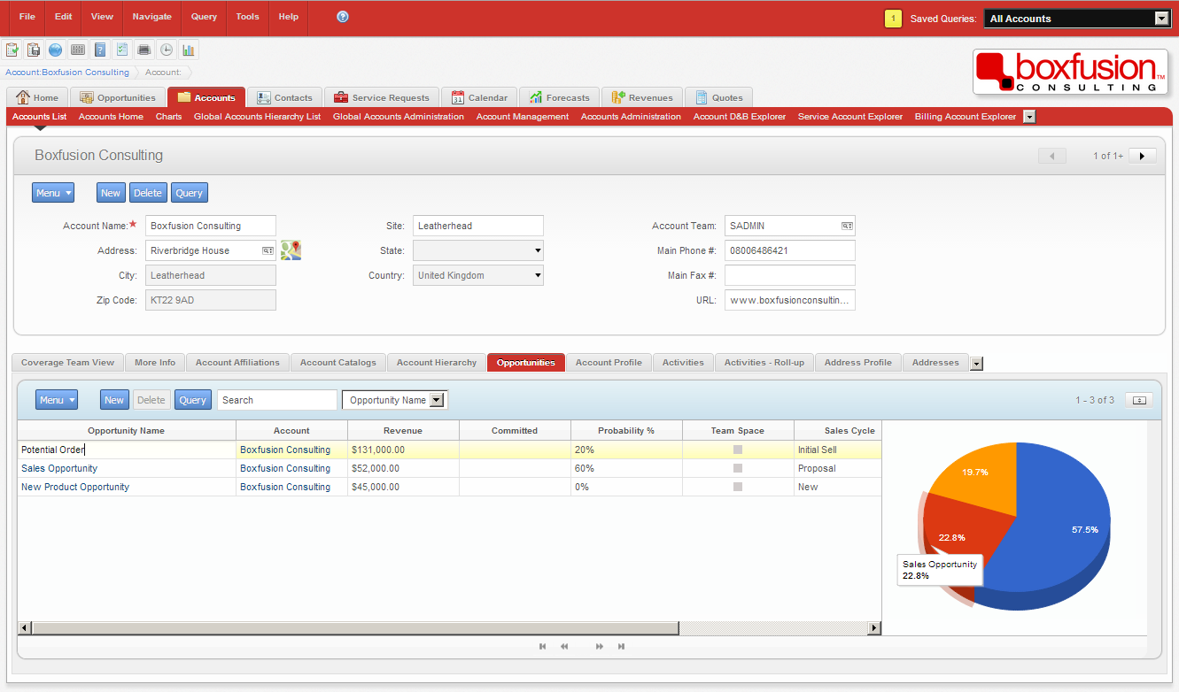 Hover over a slice of the pie for further details, and click to drill down on the relevant record.
Another great example of the flexibility we have in displaying our data can be seen in the following two screenshots. Rather than displaying activity records in a simple list, I’ve created an applet which plots the activities on a timeline – users can scroll through time and zoom in and out, and once they’ve found the record they’re looking for, again they simply click to drill down.
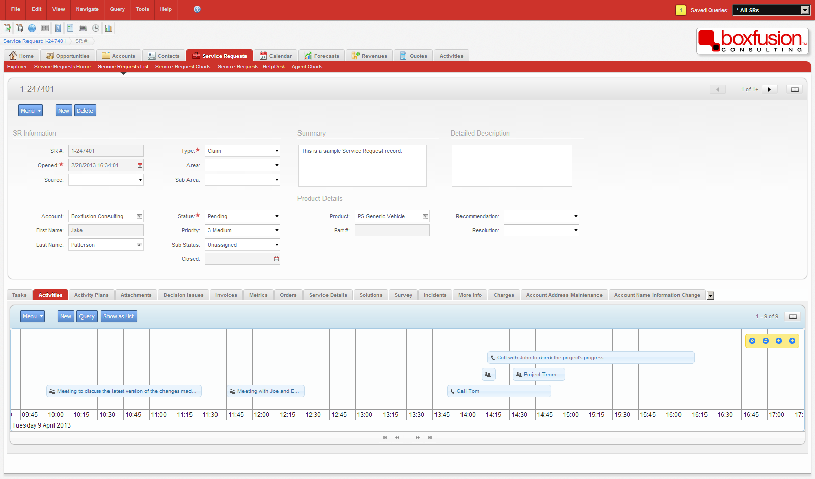 In the image above, the 'Timeline Applet' visually displays Activities over a period of time. Using the mouse to drag left and right takes the timeline into the past or future.
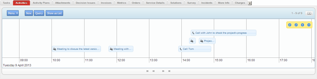 If the user zooms in by using the mouse scrollwheel, a more detailed view of a period of time is shown. The timeline was built using the jQuery Timeline Plugin.
Using the timeline in this way is great for environments where data is viewed more often than it is edited, but when more advanced editing or querying is required the user has the option to switch back to the standard Siebel list applet. Providing users with more intuitive, easy-to-use interfaces and interaction methods, along with real options – such as the ability to choose for themselves how they wish to see their data – could play a part in significantly improving the user acceptance of an application.
Neither of the concepts I have shown you today would be possible to realise in Siebel’s High Interactivity user interface, but both were quite simple to build in Siebel Open UI in under two days, making use of a number of standard web technologies such as CSS3, JavaScript and, in the case of the timeline, a jQuery plugin. It’s important to remember that these are just two examples and by no means represent the extent of the options available to us in Open UI. I do hope, though, that these examples have given you a taste of some of the fantastic possibilities brought about by the Open UI framework. As a Siebel consultant, I’m really looking forward to seeing more of the exciting ways we’re able to leverage this flexibility to improve the way Siebel data is displayed and manipulated within applications, and to genuinely improve the experience for users.
In the next part of this series, I will be discussing some of the various ways we can utilise Siebel Open UI’s extensibility to add new features to the Siebel application in order to further enhance the user experience.

1 min read
6 min read
4 min read