Past Event: Nov 09, 2023
Retrouvez Boxfusion Consulting lors de l’événement Oracle Applications Unlimited Days, en France
1 min read
In the final part of this series looking at the user experience benefits of the Siebel Open UI framework, we will look at how the features and properties discussed in the previous posts can be brought together to create a user interface which complements business requirements and processes.
As you’ve seen from the screenshots in my previous posts, one of the most immediate changes available to us in Siebel Open UI is the ability to apply themes and manipulate the overall style of the application. With Open UI, it’s very easy to change branding and colour schemes; at its simplest, this could be useful for creating a consistent look-and-feel between a number of applications within a business, but another real benefit lies in the ability to create a truly accessible Siebel application suitable for users who have a variety of different needs. Users who are colourblind, for example, could be provided with a theme which uses colourblind-safe colours, and users who prefer larger or higher-contrast fonts could also be provided with more suitable themes.
Siebel’s current ActiveX-based framework does allow for a certain level of customisation, such as through the editing of web templates and basic colour schemes, and the rearranging of applets within views, but the ActiveX component itself – which handles all the complexity of building the controls on the screen – is completely black box and cannot be manipulated by developers. As a result, although there is the ability to make simple visual customisations, these are quite severely restricted by the nature of the ActiveX controls.
Siebel Open UI, on the other hand, allows us to break free from the restrictions of ActiveX; the new framework replaces the undocumented, black box ActiveX controls with an open and comprehensive platform specifically designed from the ground up to be customisable. The result is the ability to move away from the usual list and form paradigms, and where appropriate create applets which display data in radically different ways – as you’ve seen with the timeline applet I created in the first part of this series. By changing the way data is displayed and interacted with, we can provide more intuitive user experiences which help users to work more effectively and efficiently, and which align more closely with the modern-day applications users are familiar with.
While writing this blog post I wanted to give you an idea of how we can customise the Siebel user interface in order to more closely align with how users work with their data. In reality, businesses often have a number of complex processes which users must follow within Siebel, and often these processes are not as smooth or as intuitive as users might like. Siebel Open UI can improve situations like these by giving us the flexibility to mould the UI and the underlying application to the business processes. We have more fine-grained control of how users interact with the application – whether that be simply inputting data or using some of Siebel’s more advanced tools such as Task UI and Product Configurator (both of which have been upgraded to take advantage of Open UI) – and this allows us to tweak or even totally overhaul those business processes so they more closely align with real-world requirements and user expectations.
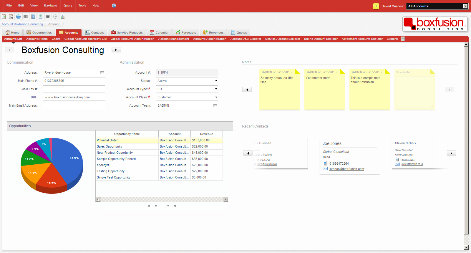
With that in mind I have created an Account Dashboard view within my Siebel environment, which could be used by salespeople to provide a quick overview of an account record. So far much of the focus of these posts has been on how we can make changes to individual applets in order to make data more accessible, and while it’s difficult to show the true power of Open UI in a wider context through simple screenshots of a demo environment, the aim of this exercise is to demonstrate that – thanks to the combination of all of the benefits we’ve seen in previous posts – it is possible to build interfaces which move away from the traditional Siebel look-and-feel.
You can see the result in the screenshot below – I’ve created a simple dashboard which contains high-level information about an account. This includes the usual fields such as addresses and telephone numbers, as well as a list of current opportunities, recent contacts and notes.
 This dashboard view demonstrates the flexibility provided by Siebel Open UI to design custom, intuitive user interfaces.
You’ll see from the screenshot that I’ve combined two methods of displaying applets: the account data and opportunity list are clearly our standard Siebel form and list applets, with some stylistic changes, while the notes and contact data are displayed in an entirely new way. I think it’s important to distinguish between these two methods because, while Open UI gives us the flexibility to change the Siebel UI in any way imaginable, there’s simply no point re-inventing the wheel for every applet and every screen! However, I felt that both notes and contacts would benefit from being displayed in a more visual way. On the screen it’s possible to scroll through both notes and contacts, and while the contacts are read-only (simply click the name to drill-down) notes are fully editable – you can see the faded note on the far-right which, when clicked, provides a text box for the user to create a new record.
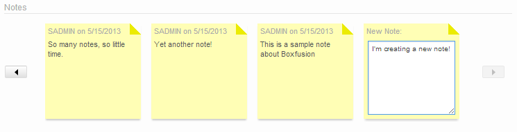
With Siebel Open UI we can create simple, intuitive data-entry methods to improve the user experience.
While this example doesn’t demonstrate Open UI’s features within the context of a complex business process, I hope that you can see how we can use it to create user experiences which are free from many of the restrictions typically found in Siebel High Interactivity environments. At Boxfusion we have already implemented a proof-of-concept which has proven Open UI’s ability to redefine how business processes are executed within Siebel. The ability to restructure entire applets and views to provide modern and intuitive user experiences will not only improve users’ perceptions of the Siebel application but will no doubt improve how effectively they work with the application too. From a developer’s perspective, Siebel Open UI is a truly exciting update which provides a fresh new way to solve problems and implement business requirements.
Thank you for reading this blog series on the user experience benefits of Siebel Open UI. I have only touched the surface of the capabilities of this powerful new framework and I’m looking forward to being able to show you more of the features it offers in the near future!

1 min read
6 min read
4 min read