Past Event: Nov 09, 2023
Retrouvez Boxfusion Consulting lors de l’événement Oracle Applications Unlimited Days, en France
1 min read

Author: Andy Stevens
6 min read
Using the screen space effectively and in general, simplifying the UI, can be a simple but key method of improving usability. In this post we will look at approaches to rapidly improve the usability of the Siebel CRM application by making the most of the available screen space. This is especially important if users are working with smaller sized laptop or desktop screens or, more pertinently, mobile devices such as tablets and smartphones. Ideally, we only want to display useful information that the user needs frequent and quick access to, reducing any “clutter” such as infrequently used information and icons, whilst also maintaining the ease of accessibility to that seldom used information.
One particular area of the UI which has a tendency to be used infrequently is the menu bar and button toolbar. These can take up a substantial portion of the screen and result in the need to scroll down to view the desired applets. Nevertheless, these items are essential in allowing the users to navigate to certain screens such as the site map, as well as providing the facility to access many other functions. With Open UI we are able to hide these items by default, leaving us with a slick, clutter free UI, maximising the effective screen size whilst also maintaining the ability to access the menu and toolbar as and when they are required. This can be achieved by dynamically displaying the bars - triggered by either a mouse hover or finger swipe, depending on the application type.
Such a task is made possible by harnessing the capabilities of Open UI – taking advantage of the CSS and Javascript functionality that can be layered on top of the standard Siebel tools configuration. The following section outlines how we achieve our goal without the need for any changes in Siebel tools.
First, we will go through how to dynamically display the menu in the desktop application simply by hovering over the top area of the screen.
The first step in the process is to shift the elements on the screen up so the menu and toolbar are off the screen and out of sight by default. This is done by modifying the theme-base.css, setting the ‘top’ property for each element as appropriate. This property will be dynamically altered using a custom Javascript file later.
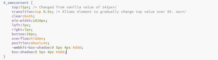
Fig 1: CSS Changes
Within the CSS file we may need to change the ‘position’ property for certain elements in order for changes to the ‘top’ property to take effect.
We now want to write some code that will allow us to shift the elements back to their original position so they are visible on the screen. We want this customised code to be global as we require this functionality to work on every view across the application. To achieve this we will write the code in a custom js file that will run on postload.
We do this by including the following line in our code:
Within our customPostload function we want to capture the hover event and use it to trigger the display of the menu and toolbar.
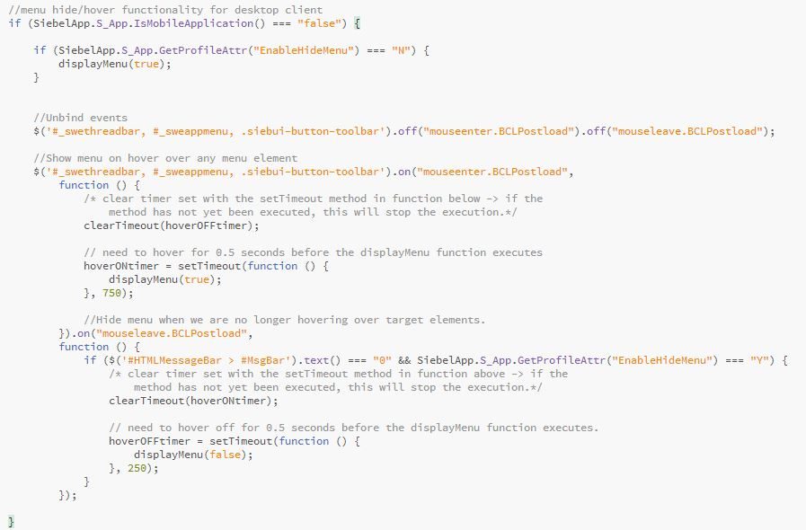
Fig 2: Function to hide/show menu bar.
As you can see, we make use of the setTimeout method to ensure the display and hide menu functions are only executed if the mouse hover is maintained for a certain length of time.
The displayMenu() function changes the top value of the CSS elements and is called within the mouseenter and mouseleave events.
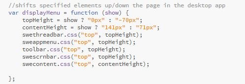
Fig 3: Function to dynamically change the CSS "top" property of our specified elements.
In our case, it was decided that changing the “top” property would be the best option to achieve the effect we wanted – doing it this way produced a much smoother effect than using either the slideUp() or hide() methods.
The last point to make here is that with open UI, the application menu now houses the notifications alert icon. To ensure the user does not miss a notification we must force the menu bar to always show when a notification is present. We can force this by having a condition to check the number of notifications before hiding the menu.
However, we also want the menu bar to automatically come down as soon as a notification comes in, so the user is made aware of it immediately. To do this we need to modify the vanilla file, msgbrdcstpr.js - this file contains the code responsible for the blinking notification icon.
Lastly we will need to add our custom js file to the manifest administration through the UI. This is set up in a similar fashion to postload.js.
Note: If we wanted, we could extend our functionality to make it optional for each user, simply by adding an “Enable Hide Menu” flag on the Employee BC, setting up this field in the Personalization Profile BC and displaying this field as editable in the user preferences on the UI. We could then retrieve this value using the GetProfileAttr method and enclose our code within a conditional statement in our custom postload file:
A dynamically displaying menu can be set up in a similar fashion for the mobile application.
For the mobile application different CSS files are used to render the theme, so again, we must alter the relevant CSS properties to get the layout of the menu and toolbar as we desire on the screen. I have chosen to position the menu to the left of the screen - a swipe to the right will produce the menu and a swipe to the left will hide it again. The files that require modification in this case are theme-mb-style.css and theme-mb-structure.css.
The Javascript required is similar to what was written for the desktop application but rather than hover, we make use of the swipe events. We can put this code in the previously created custom postload file:
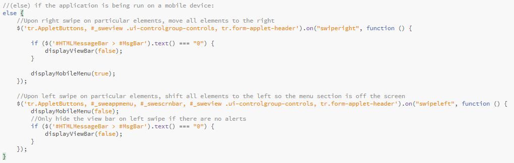
Fig 4: Function to hide/show the menu bar on a mobile device.
The else statement in this code is following on from the if statement in figure 2 which makes use of the IsMobileApplication() method to see if the application is being run on a mobile device. We can use this to separate any code which should only be applied to mobile devices.
Similar to the code for the desktop application, we call custom functions within the swipe events which will handle the CSS manipulation to show/hide the menu bar. We will only call the displayViewBar() function to hide the viewbar if there are no notifications.
Lastly we can modify the msgbrdcstpr.js, adding in some code to ensure the viewbar is automatically displayed in the mobile application as soon as a notification is received.
Hopefully, this post has given you a small insight into the potential of Open UI in improving the usability of the application!
You can also explore our other blog posts to gain an understanding of how else you are able to exploit the benefits of Open UI. Alternatively, you can read more about our OpenUI Services here or contact us for further information.

1 min read
5 min read
5 min read